Home Articles Web design & development Using colour on your website
How you use colour on your website is a huge consideration – especially if you have an established brand with a colour palette that may look great off-line but not work so well on your website. The following article outlines a few things to consider when using colour on your website.

The power of colour
Psychologists suggest that colour influences nearly 90% of purchasing decisions as it can trigger emotions that can affect your behaviour. Having such a significant impact on how people respond to your website means that selecting the right colour palette needs to be prioritised as part of the design process.
Different colours have psychological associations. These will be different for everyone according to many factors such as your background, culture, age, gender.
Using colour to enhance your brand
So when deciding on your colour palette for your website – where do you start? A good web development company will use your brand logo, colour and style as the starting point and incorporate it seamlessly into the design to create an engaging and consistent website.
Where to use colour
Using colour on your website will make it more attractive and engaging. To get the effect you are looking for, use colour to highlight specific areas rather than adding it randomly and inconsistently to pages. Use colour to highlight:
- Headlines
- Buttons and calls to action
- Primary text panels, hero graphics
- Banners
Your web developer should build these colours and headings into your content management system and provide the tools for you to access them. Having these key elements built-in allows you to use colour consistently across your website.

Use colour for impact
You can use contrasting colours to make web text stand out and easier to read. The psychological principle known as the Isolation Effect states that an item that “stands out like a sore thumb” is more likely to be remembered. Research shows that people remember something more (be it text or an image) when it blatantly sticks out from its surroundings.
According to a study published on Moz, an online slot machine company changed the call to action button from green to yellow, resulting in a 187.4% increase in conversions! A call to action button needs to stand out from the rest of the content.
Use colour to highlight
As well as using colour to highlight key elements on your website, you can also use it to highlight the importance of headings or content or to identify different topic strands across the website. This creates clarity for those navigating the website and helps emphasise a clear user journey.
What colours to use
With 16.8 million colours to choose from, the options can be overwhelming. Considering the psychology of colour and using a colour wheel can help. There is advice and resources at https://www.pantone.com and Adobe where you can use a digital colour wheel to experiment with colours and pick complementary colour schemes. A few ways Adobe suggest choosing a colour palette include:

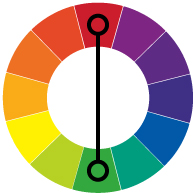
Opposites attract
Create a vibrant look by pairing contrasting colours. You have to be a bit careful as the effect can be jarring, but it will help to make something stand out.

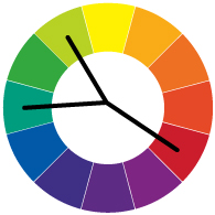
Split the complement
If two contrasting colours are too bold, you could choose a base colour and use the opposite, two adjacent colours. This colour scheme has a strong impact but using a third colour makes it less aggressive.

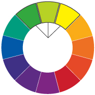
In close harmony
Picking three colours next to each other on the wheel presents a harmonious effect, but you need to make sure you have enough contrast in the design as it could get overlooked and not have the desired effect of standing out enough.
Get in touch
Our web designers can incorporate your existing branding to create a seamless design that uses colour to enhance and engage your visitors. Our team of expert designers can advise on how colour will work best with your branding and product range to create a website that gets results. Get in touch and find out how we can help your business.